ET monogram

Sheet 02 · Web app, live · 2026

UX Research AppFrom an idea to real user research

Founders often ask friends "would you use this?" and hear a polite yes. This app turns one sentence about an idea into research that can prove it wrong.

"Fall in love with the problem, not the solution." The rule the app is built on

PlanResearchSynthesizeDesignBuild

Plan

Start with one sentence

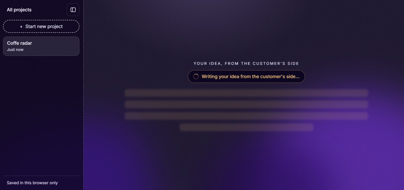
The first screen asks a single question: what are you building? Before any research, the app rewrites the idea from the customer's side, so the founder starts from the problem people have, not the feature they want to build.
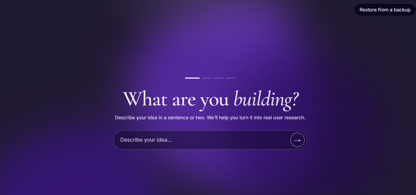
The start screen: the title What are you building? above a single input that says Describe your idea
Viewport A. One question, one input. A short progress line shows where you are.
The app writing the idea from the customer's side, with a sidebar listing saved projects
Viewport B. The idea, rewritten from the customer's side. Projects stay in the sidebar.

There is no account. Projects are saved in the browser only, and "Restore from a backup" brings them back. People can try it without handing over an email.
Plan

Pick how to learn

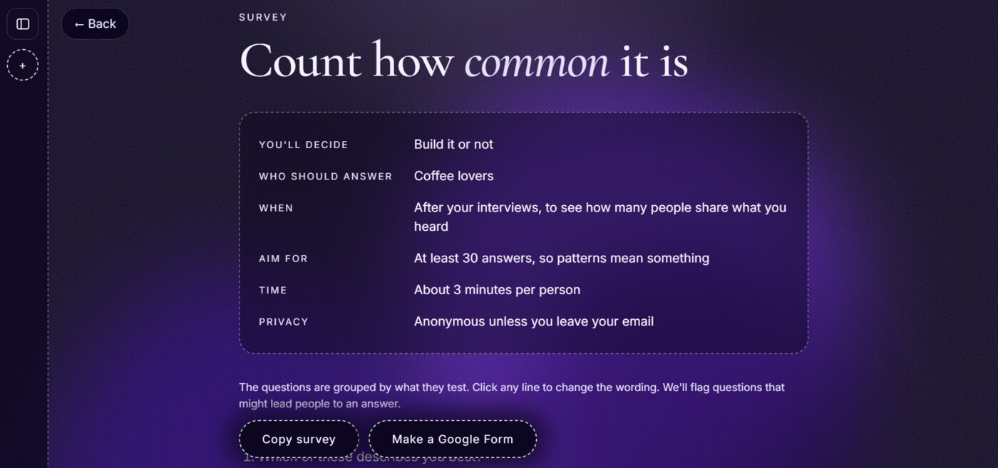
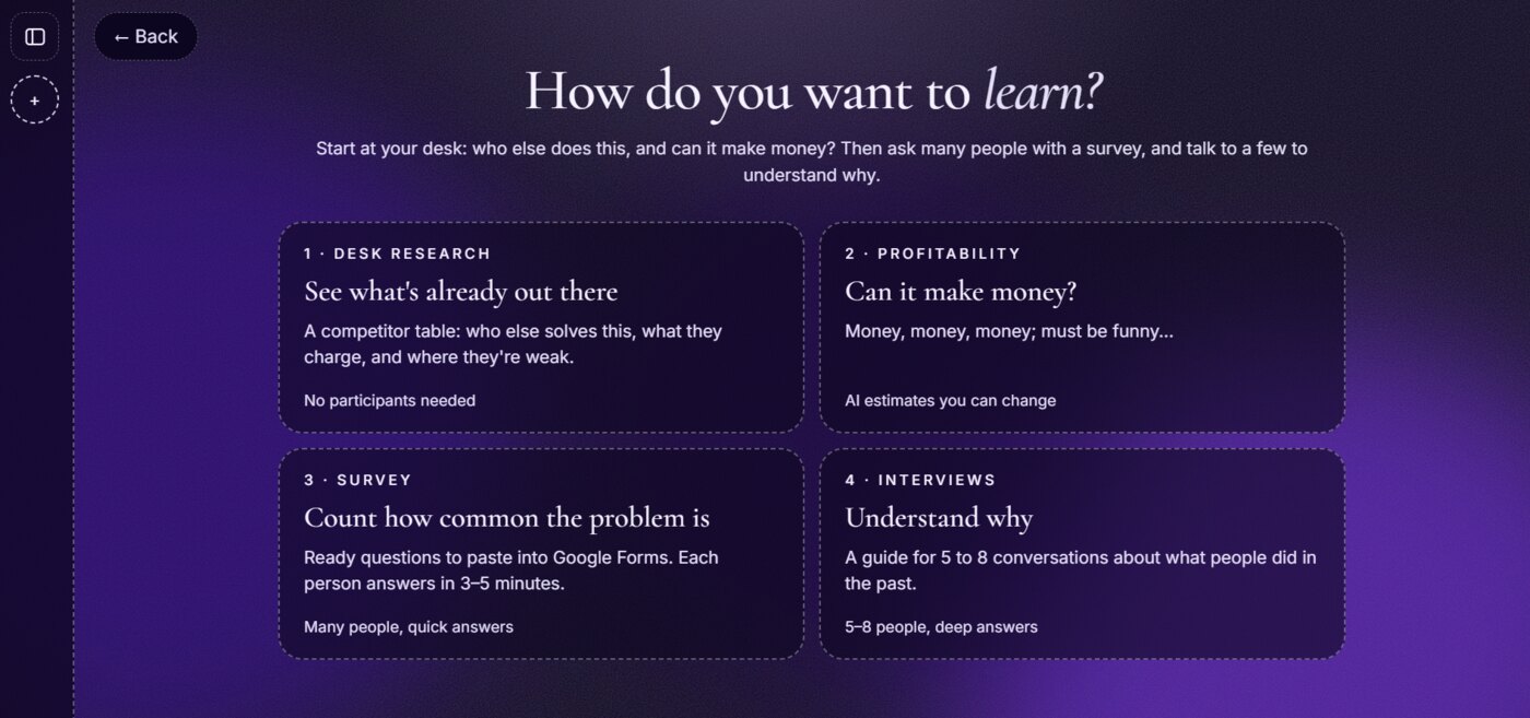
Then the founder picks a method. The four cards follow the order I learned in my Google UX course: start at your desk, check the money, count with a survey, and understand why with interviews. Each card says what it costs in people and time, so nobody runs interviews when a desk search would answer the question.

Four method cards: desk research, profitability, survey and interviews, each with a one-line goal and how many people it needs
Viewport C. Four methods, each with its cost in people: none, AI estimates, many quick answers, 5 to 8 deep ones.

Research

Desk research: the competitor audit

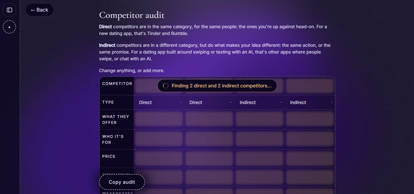
The audit explains direct and indirect competitors in plain words, with an example, then fills a table with two of each: what they offer, who it's for, price, strengths and weaknesses. Every cell can be changed, and the whole audit copies out in one click.

The competitor audit screen: a short explanation of direct and indirect competitors above a table that is loading two of each
Viewport D. Two direct and two indirect competitors, loading into an editable table.

General notes

How I built it

I wrote the product spec, designed the flow and built it in plain JavaScript with Claude Code, deployed on Vercel. Every screen asks one thing at a time, and the copy stays in plain words, because the people using it are founders, not researchers.

I made it while working through my Google UX Design certificate courses. Each screen puts one lesson into practice: write a research plan first, ask about the past instead of the future, and pick the cheapest method that answers the question.

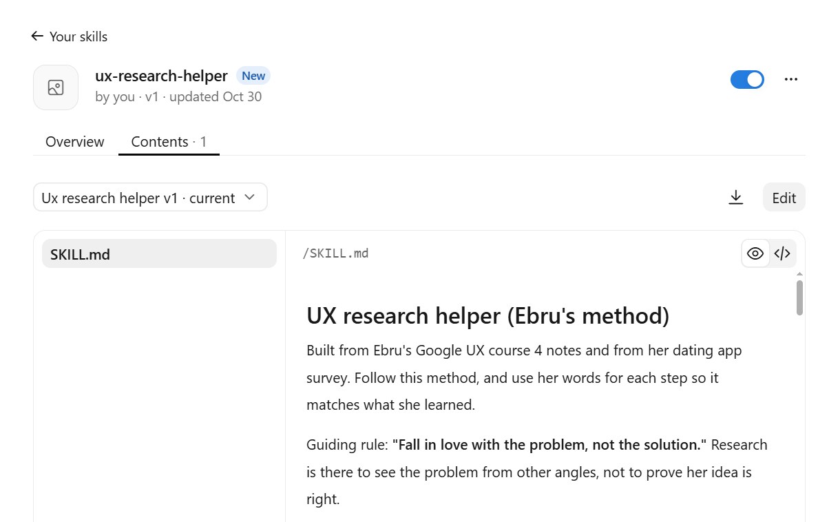
I also turned my course notes into a Claude skill: my own research method, written down so an AI assistant follows it step by step, from plan to research to synthesis. I built it from my notes for course 4, on conducting UX research, and from my dating-app survey. I used it for this app, and I keep using it for every study since.

My ux-research-helper skill in Claude: UX research helper, Ebru's method, built from my Google UX course 4 notes and my dating app survey, with the rule Fall in love with the problem, not the solution
Viewport F. The skill, saved in my Claude account.

ux-research-helper · SKILL.md

Plan → research → synthesize. Always say which step we're on.

Before any data comes in

Write 2 or 3 "I'm wrong if…" rules with numbers, and check the results against them first.

Try it live → ← Back to all sheets